http://archvirtual.com/blog-2/
http://secondlifetutorials.blogspot.com
http://tetravol.com
Monday, 11 June 2012
BLOG'S FROM PREVIOUS YEAR
http://zphi002arch.blogspot.co.nz/2011_04_01_archive.html
http://carolineofficedesign.blogspot.co.nz/
http://yejinyoon.blogspot.co.nz/2011_06_01_archive.html
http://carolineofficedesign.blogspot.co.nz/
http://yejinyoon.blogspot.co.nz/2011_06_01_archive.html
LIBRARY (FINAL) PICTURES
The 5th Floor has been removed as it didn't fit with
our design and was surplus to requirements.
Therefore we have moved the study area onto the
4th floor.
Also vegetation has been added around
our library to liven its surroundings.
Our library
has been designed to personify a human heart,
highlighted by the shells that imitates
the actual
shape of a heart. The exterior is plain and simple
to show the simplicity of the physical
heart but the
interior is very complex to convey the complex
personal feelings and emotions of the heart,
highlighted with the transparent floor on ground
level that acts like a dome for the sub-conscious
thoughts.
"A book should not be judged by its cover, but by
what it possesses internally".
FRONT VIEW OF LIBRARY
 |
| Shows the primary elements of the library. |
TILTED VIEW OF THE 3RD AND 4TH FLOOR

Shows the brown, bubinga texture of the
of the
higher storeys.
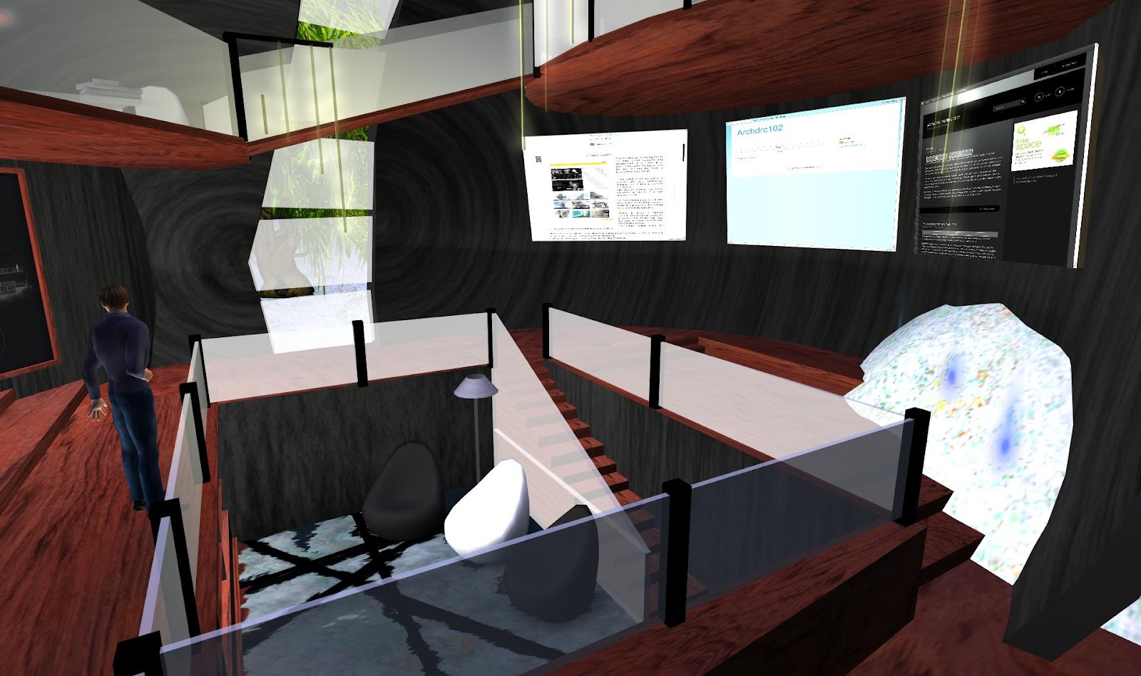
ON THE SECOND FLOOR

Shows the positioning of our blog walls, as well
as the clear
glass barriers that make up the first
floor. Our elevator is also a main feature in this
level.

make up our library.
The lights on the upper levels have been manipulated
through
Scratch to move in and upwards/downwards
direction as well as disappear. Also our glass wall
window feature is interesting as it creates a distinctive
shadow pattern that moves around
library throughout
the day.
THE ELEVATOR

An elevator has been installed for easy access
to the upper levels of the
library.
CLOSE UP ON THIRD FLOOR

The wall texture on on the inner shells of our
library contain multiple
linear patterns to give
the occupants of the library an interesting place
to relax.
THE BRIDGE

It is simple with transparent glass barriers as
the bridge is visible from the front view and is
a critical element to the look of the library.
THE GLASS WALL

creates different shadows throughout the
different times of day.
THE LATTER STAGES
The main element of this stage of our construction
process was the addition of the 5th floor.
FRONT VIEW

personifies the brain from the "open heart"
shells.
CLOSE-UP VIEW

Shows the connection between the floors from
level 3 to level 5 with the brown bubinga
texture
linking the storeys together.
THE 5TH FLOOR

This area is a book shelf and study area.
Particles are used on the roofing to
imitate stars
on the sky. The staircase almost acts as a tendon
link from the "brain"(5th level)
to the "heart"(Shells)

level possible to relax the occupants with the
beautiful surrounding scenery. Also the glass
skylight on top of the roof gives the occupants
natural light instead of artificial.
5TH FLOOR BOOK SHELF

that people visiting the library would have to
visit all levels in order to get out books,
therefore personally experiencing the whole
building.
GETTING STARTED
The main theme behind our library is to use two semi- spherical shells to create a heart- like shape.
Our library is situated on a hillside so we can challenge ourselves to adapt to
the surroundings.
FRONT-SIDE VIEW

FRONT VIEW

SIDE VIEW BACK VIEW


FINAL DRAWINGS

Through experimentation of previous concepts and developments, we gathered all the elements that we liked and we came up with our final design.
SYMBOLISM: The two shells personify the human heart and as the exterior is very plain, it conveys the simplicity of the outer heart. However the building being black portrays mystery. The interior is sophisticated with numerous features showing the complexity of the inside of the heart, such as emotions and feelings. Our hidden feature, the transparent floor on the ground level, is a dome for the sub-conscious mind where deep thoughts are gathered.
INTERIOR: Our library consists of numerous levels, where occupants can explore each floor almost like a journey. The ground floor will have our 9 journals placed on bookshelves. The 2nd floor will contain the 3 blog screens. This floor will have internationally known architecture websites, and our 3 blog addresses. A circular elevator takes the occupant to the 3rd Floor. Here we will have some chairs and a table where people can sit and read. Going up the ramp will be the study area. We will have a lot of tables and chairs for users to sit down and have some quiet study.
EXTERIOR: The outer walls are very smooth and simple. The circular form with straight lines were too direct and corners were distracting, as opposed to the sphere, there is a
feeling of rotation and forever spinning.
LANDSCAPE: A site should be located where there are some geographical structures as it could provide scale and show some sense of reality.
MATERIALS: Possibly low cost, standard construction where walls will be made of wood and beams and cantilevers will be made of steel.
FURNITURE: We will be modelling some chairs and tables ourselves but some furniture will need to be bought at the Second Life Marketplace.
TEXTURES
TEXTURE 1

of our library to apply a futuristic look. The rounded
linear patterns will help with this effect.
TEXTURE 2

sense of a shiny, clean satin like leather.
We used the Curves and Level in Photoshop
to heighten the individual lines. We then used
the spotlight tool (omniscient light) to focus on
the centre, brightening up the inside and slowly
darkening the outside.
Subscribe to:
Comments (Atom)