http://archvirtual.com/blog-2/
http://secondlifetutorials.blogspot.com
http://tetravol.com
Monday, 11 June 2012
BLOG'S FROM PREVIOUS YEAR
http://zphi002arch.blogspot.co.nz/2011_04_01_archive.html
http://carolineofficedesign.blogspot.co.nz/
http://yejinyoon.blogspot.co.nz/2011_06_01_archive.html
http://carolineofficedesign.blogspot.co.nz/
http://yejinyoon.blogspot.co.nz/2011_06_01_archive.html
LIBRARY (FINAL) PICTURES
The 5th Floor has been removed as it didn't fit with
our design and was surplus to requirements.
Therefore we have moved the study area onto the
4th floor.
Also vegetation has been added around
our library to liven its surroundings.
Our library
has been designed to personify a human heart,
highlighted by the shells that imitates
the actual
shape of a heart. The exterior is plain and simple
to show the simplicity of the physical
heart but the
interior is very complex to convey the complex
personal feelings and emotions of the heart,
highlighted with the transparent floor on ground
level that acts like a dome for the sub-conscious
thoughts.
"A book should not be judged by its cover, but by
what it possesses internally".
FRONT VIEW OF LIBRARY
 |
| Shows the primary elements of the library. |
TILTED VIEW OF THE 3RD AND 4TH FLOOR

Shows the brown, bubinga texture of the
of the
higher storeys.
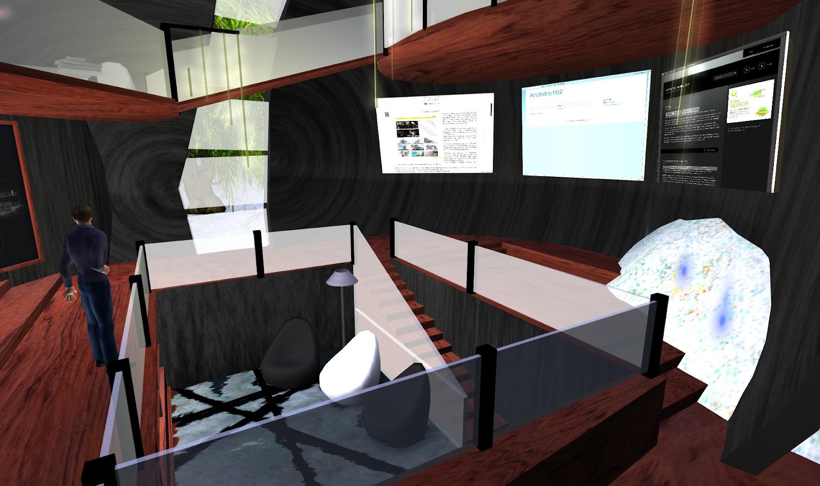
ON THE SECOND FLOOR

Shows the positioning of our blog walls, as well
as the clear
glass barriers that make up the first
floor. Our elevator is also a main feature in this
level.

make up our library.
The lights on the upper levels have been manipulated
through
Scratch to move in and upwards/downwards
direction as well as disappear. Also our glass wall
window feature is interesting as it creates a distinctive
shadow pattern that moves around
library throughout
the day.
THE ELEVATOR

An elevator has been installed for easy access
to the upper levels of the
library.
CLOSE UP ON THIRD FLOOR

The wall texture on on the inner shells of our
library contain multiple
linear patterns to give
the occupants of the library an interesting place
to relax.
THE BRIDGE

It is simple with transparent glass barriers as
the bridge is visible from the front view and is
a critical element to the look of the library.
THE GLASS WALL

creates different shadows throughout the
different times of day.
THE LATTER STAGES
The main element of this stage of our construction
process was the addition of the 5th floor.
FRONT VIEW

personifies the brain from the "open heart"
shells.
CLOSE-UP VIEW

Shows the connection between the floors from
level 3 to level 5 with the brown bubinga
texture
linking the storeys together.
THE 5TH FLOOR

This area is a book shelf and study area.
Particles are used on the roofing to
imitate stars
on the sky. The staircase almost acts as a tendon
link from the "brain"(5th level)
to the "heart"(Shells)

level possible to relax the occupants with the
beautiful surrounding scenery. Also the glass
skylight on top of the roof gives the occupants
natural light instead of artificial.
5TH FLOOR BOOK SHELF

that people visiting the library would have to
visit all levels in order to get out books,
therefore personally experiencing the whole
building.
GETTING STARTED
The main theme behind our library is to use two semi- spherical shells to create a heart- like shape.
Our library is situated on a hillside so we can challenge ourselves to adapt to
the surroundings.
FRONT-SIDE VIEW

FRONT VIEW

SIDE VIEW BACK VIEW


FINAL DRAWINGS

Through experimentation of previous concepts and developments, we gathered all the elements that we liked and we came up with our final design.
SYMBOLISM: The two shells personify the human heart and as the exterior is very plain, it conveys the simplicity of the outer heart. However the building being black portrays mystery. The interior is sophisticated with numerous features showing the complexity of the inside of the heart, such as emotions and feelings. Our hidden feature, the transparent floor on the ground level, is a dome for the sub-conscious mind where deep thoughts are gathered.
INTERIOR: Our library consists of numerous levels, where occupants can explore each floor almost like a journey. The ground floor will have our 9 journals placed on bookshelves. The 2nd floor will contain the 3 blog screens. This floor will have internationally known architecture websites, and our 3 blog addresses. A circular elevator takes the occupant to the 3rd Floor. Here we will have some chairs and a table where people can sit and read. Going up the ramp will be the study area. We will have a lot of tables and chairs for users to sit down and have some quiet study.
EXTERIOR: The outer walls are very smooth and simple. The circular form with straight lines were too direct and corners were distracting, as opposed to the sphere, there is a
feeling of rotation and forever spinning.
LANDSCAPE: A site should be located where there are some geographical structures as it could provide scale and show some sense of reality.
MATERIALS: Possibly low cost, standard construction where walls will be made of wood and beams and cantilevers will be made of steel.
FURNITURE: We will be modelling some chairs and tables ourselves but some furniture will need to be bought at the Second Life Marketplace.
TEXTURES
TEXTURE 1

of our library to apply a futuristic look. The rounded
linear patterns will help with this effect.
TEXTURE 2

sense of a shiny, clean satin like leather.
We used the Curves and Level in Photoshop
to heighten the individual lines. We then used
the spotlight tool (omniscient light) to focus on
the centre, brightening up the inside and slowly
darkening the outside.
EFFECTS
ALPHA CHANNELS

This is a portion of each pixel's data that is
saved for transparency information. A 32 - bit
graphics systems contain four channels;red,
green, and blue (RGB) and one alpha channel.
The alpha channel is in fact only a maskand it
specifies how the pixel's colours should be
merged with another pixel when the two are
overlaid, one on top of the other.
OFFSET

A horizontal or sloping surface formed
where a wall is reduced in thickness towards the top.
LIGHTING EFFECT

The distribution of lighting on an object .
Our group incorporated the use of spotlight
and omni light to cast onto the images.
JOURNAL 3 - ARCHITECTURAL HISTORY
ARCHITECTURAL HISTORY
Architecture, metaphor and the mind
By John Onians
-Making and experiencing of buildings are are both associated with distinctive mental operations and this association is apparent in our use of language.
-Metaphors are used in architecture to articulate our thoughts because the processes of design relate to basic mental operations and basic psychological needs.
- Architectural metaphors are used to make us feel better in our bodies where operating through our mind. Architectural metaphors satisfy us mentally because they recall the unique way architecture satisfies us physically.
- There is a direct parallel between between the naming of a concept and the making of a physical mark on the ground is that is that the name and mark both permit the concept to be shared.
- There may be a precise correlation between man's ability to handle a growing body of knowledge and his need to build more and more complex buildings.
- The sympathy between architecture and the mind is biological.
- The most abiding architectural metaphors were those which saw knowledge and society as both requiring an architectural solidity.
JOURNAL 2 - LANDSCAPE NEW ZEALAND
WANAKA IN HER VIEW
WORDS Philippa Jones
PHOTOGRAPHS Martin Hill


Wanaka come with landscapes both natural and man-made. Migrating from Urban Auckland to a rural hillside, I have a whole new challenge ahead of me. Shaped long ago by a glacial movement into low rolling hills and plains set against distant mountains, the rugged ridge lines contrast with the ruler- straight horizontal of river terraces. The climate is extreme with frost prone with scorching dry summers, therefore planting is limited. The wind is a prevailing north westerly and the importance of views are they two key factors o consider whens designing a landscape in Wanaka.
"THE WIND IS A FACT OF LIFE HERE THAT YOU HAVE TO ALLOW FOR. YOU HAVE TO CHOOSE OUTDOOR FURNITURE THAT DOESN'T BLOW AWAY AND AVOID THINGS LIKE UMBRELLAS THAT FLAP".
Wanaka's existing established trees cape i mostly of exotic species. The huge historic poplars of Albert Town at roughly 100 years old are nearing the end of their lives and need to be replanted. Wanaka is a clean slate in terms of expressing its own individual character and it's important that council regulations get it right. While Wanaka's District Plan is ideally designed to preserve its character, anomalies happen such as surrounding a house so that it appears stranded in the centre as if its inside a moat. Most clients are seeking low maintenance landscaping, partly because so many houses are holiday homes and therefore are empty a lot of the time, and in their spare time they do not wish to work on the garden, but prefer to be out enjoying the outdoor life. However managing low maintenance gardening is not easy as geologically, the soil is very silty and gravelly.
JOURNAL 1 - AREA
CAFFE VERGNANO

PROJECT: Caffe Vergnano Warehouse and production facility
CLIENT: Casa del Caffe Vergnano Spa
ARCHITECT AND SUPERVISOR OF WORKS: Arch Robert Ferroro
BUILDER: Magnetti Building
TOTAL SURFACE AREA: 15,700 m^2
BUILT SURFACE AREA: 5305m^2
Caffe
Vergnano plant has been devised with the focus on the environment
typical of the corporate policy of the Piedmont based company.The new
building is divided into two seperate but connected blocks: the first
for a semi-products and packaging warehouse, and the second for
production. The walls of the new plant are covered on the front and side
by green climbing plants which provide the background for the caffe
vergnano 1882 sign, testifying to the company's focus on
eco-sustainability in its projects. The skin of the building is made of
exposed cement in square panels, while the central block in black, the
company's corporate colour, recalling the strict geometric design
associated with caffe Vergnano's image.This "green philosophy" is
further reinforced by treatment of the water used in production
processes and reduction of waste and emissions.
ROVERE COLLI TREVEGIANI ITLAS
 PROGETTO: abitazione privata e studio
LUOGO: Corvara
PROGETTO ARCHITETTIONICO: Emanuel Kostner
ANNO DI REALIZZAZIONE: 2011
Nature
and light, wood and design. these are key elements in the design for a
home and a private studio in Corvara, in the heart of the Val Badia. Colli
Trevigiani Oak wood from Itlas has been chosen for the home and studio,
using two different solutions with the same finish to infuse the home
with an elegant, warm, exclusive atmosphere.
The studio alternates the vast perspective of large wooden floorboards in response to the need for beautiful but practical flooring.
The studio alternates the vast perspective of large wooden floorboards in response to the need for beautiful but practical flooring.
METAL FOUNDATION (sLAB)


METAL FOUNDATION (sLAB)
PROJECT: Metal Foundation (sLAB)
SITUTATION: Aviles, Principado de Asturias, Spain
ARCHITECTS: [baragano], Impulso
TEAM: Ines Suarez, Veronica Carreno
COLABORATORS: Impulso, Tectum
BUILDER: Comsa, Esdehor, Tamargo, Contratas Iglesias
INSTALLATIONS: Cobra
DEVELOPERS: Fundacion Metal Asturias
BUILT SURFACE: 1.482 sqm
BUDGET: 4,000,000 Euros
COMPLETION DATE: 2011
The
concept of the structure was first conceived in the first visit and
from the memory of the place. The slab parks of the factory of
ArcelorMittal, where placed just by the site and the idea of staring to
play with this big pieces of steel is present from the first drawings
and working models. It's important to get an alive building, a building
to be lived, with walking roofs...a building that can be used much more
than only the timetable of the industrial parkwhere is placed, a new
space for Aviles. The steel structure and the installations are naked,
in order to be shown in the different course that the Foundation Metal
will teach in. Steel is the chosen material and main character on site
because the building is for Metal Foundation but also in the memory of
the place and of Aviles.
DRAMATIC LIGHTING

R:255 G:0 B:0 H:0 S:100 L:50
R:0 G:0 B:255 H:240 S:100 L:50
R:0 G:255 B:0 H:120 S:100 L:50
ARCHICAD


We are required to design our own treehut using the ArchiCAD 15 modelling program. As the task was about being efficient with time, the model was expected to be completed by the
end of our lab session, which is two hours. Although difficult to navigate at first, I found the program a mixture between Rhino and Photoshop and step-by-step, I was able to create my first CAD model.
The treehut itself is very simple and plain as the main objective was to be time efficient. I had decided to incorporate the tree inside the building as it gives the hut a natural approach. On top of the left side of the building is a balcony area to relax and the presence of the tree gives the hut itself a more environmental approach.
IMAGE AND RENDERING
VECTOR IMAGE: Vector graphics is the applications of geometrical primitives such as , lines, shapes, curves, and points or polygons, which are all influenced derived from mathematical equations, to represent images in computer graphics.

RASTER IMAGE: In computer graphics, a raster graphics image or bitmap is a data structure representing a rectangular grid of pixels, or points of colour, viewable through a monitor or other display mediums.
DIAGRAM: A two-dimensional representation of information
through visualization techniques.
through visualization techniques.
DIGITAL RENDERING: A process where a scene
containing all the information regarding geometry, texture, lighting
and shading as a description of the virtual scene and is outputted to a
digital image or raster image file.
DRAWN RENDERING: This occurs mainly in visual arts and is regarding the process of creating shading and texture of a drawing.
Sunday, 10 June 2012
ADDITIVE AND SUBTRACTIVE COLOUR
 ADDITIVE COLOUR: An additive color model involves light emitted from a source or illuminant. The additive reproduction process usually uses red, green, and blue (RGB) light to produce other colors. Combining one of these additive primary colours with another in equal amounts produces the additive secondary colours cyan, magenta and yellow, combining all three primary lights.
SUBTRACTIVE COLOUR: A subtractive color model explains the mixture of paints, dyes, inks and natural colorants to create a full range of colours, each caused by subtracting (that is, absorbing) some wavelengths of light and reflecting the others. The color that a surface displays depends on which colors of the electromagnetic spectrum are reflected by it and therefore made visible.


Subscribe to:
Comments (Atom)